Tuesday, April 8, 2008

Cartoon


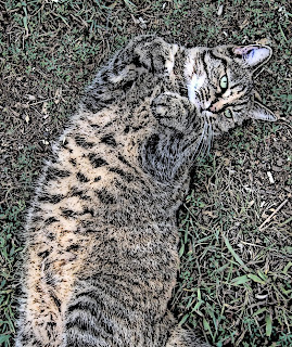
In this picture I found a picture of my cat that I had taken a long time ago. It is a good picture but in the right hand corner you could see the camera strap hanging down. So the first thing I did was crop that out. Next I wanted to make the picture a little more interesting so I decided to add a filter. I tried a few before I found on that I liked. The one I eventually choose was a filter called cartoon. I adjusted some of the settings until I got the darkness just right. I liked the way the picture turned out and that is why I decided to add it to my portfolio.

Mixing Colors


In this project I made rectangles of different shades of reds, oranges, and yellows. After I had covered the entire page with color, I used the smudge tool to blend the colors together. I purposely used all warm colors to make them blend together easier. This project can make you think of many things such as fall and the color of all the leaves or it can remind you of fire because of the hot colors. I choose this picture to put in my portfolio because it shows that I know how to mix colors and use warm colors that blend into and abstract picture.

One Word Graphic- Wild

For this picture I choose to do a one word graphic with the word WILD. I thought this was a good word to choose because there was a lot I could add to the letters to make them look more interesting. I added a back shadow and choose to add a filter instead of a color. The filter I choose was the leopard print filter. I am happy the way it turned out because the letter really look like the word they are describing.

One Word Graphic- TALL

In this picture I choose to do a one word graphic project. This is where I take a word that is an adjective and make it look like what it is describing. For this project I choose the word tall. The first thing I did was choose the font that I wanted and changed the letters to the appropriate size. The next thing I did was change the color of the text and added a drop shadow to give the letters a more interesting look. The last thing I did was to make a curve in the letters to make them look pointed and tall.

Tuesday, April 1, 2008

Oilify Emma


In this project I took a picture of my dog Emma. When I loaded up on my computer it was extremely clear but it was a little bit off center. Since Emma's head was tilting to the side, it made the center look way off. To fix the problem I cropped the photo so the focus was tighter on her face. Originally your eye was not drawn directly to her face, but her whole body, so cropping it helped a lot. After that I experimented with some filters to see what would look the best. I eventually found the “oilify” filter. I feel it gives the picture a painting like feel and gives her eyes a more drastic appearance. I thought this was a good picture to add to my portfolio because it shows my cropping and filtering skills.

Inventing a Hoax


In this project I used about four layers. My original picture is of me riding my horse. Since I wanted to put wings on either side of the horse I had to make two other separate layers. After I was done putting wings on my magical horse I originally choose to make the galaxy filter as by background, but I found that it was too dark and it was hard to see my horses wings. Then I decided to make a picture with a sunset be my background because it goes along with my story and you can see it clearer. Some of the major tools I used were the eraser to trace out my pictures and the layers setting to create my project. I also used the move tool so that I could line up my horse and wings exactly where I wanted them. Overall I had a fun time doing this project.

Experimenting With Filters

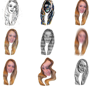
For this project I found a picture of myself and erased everything in the photo except my head. After that I duplicated it nine times. After I had lined up all nine faces exactly where I wanted them, I applied filters to each of them. I had a fun time with this project. Each picture turned out really different. On some of the faces I made blurry or distorted and on other I gave them cartoon like features. Some of the tools I used were the move tool which was really helpful in lining up all the pictures. Another tool I used was the eraser to get rid of the original pictures background. I choose this picture to be in my portfolio because I though it was a good example of what I have learned with filters and layering.

Beautiful Building Project


This project was fairly challenging for me, drawing on the computer is not as easy as it looks! My main goal for the picture was to make it as realistic as the original picture as possible. I tried to match brick with brick and keep the colors of things like the door the same. I liked using all the textures because I thought I gave a lot of contrast to the picture and made it more interesting to look at than just plain colors. I also used a black paint brush to outline my project because I though I looked neater than trying to match all the colors and textures.

Abstract Project

In my abstract art project I used many circles and ovals. I also used other shapes with soft rounded lines. There were no sharp edges or corners on any of my shapes. The tools I used to create my art project were the ellipse select tool, which allowed me to make perfect round circles. I also used the free select tool which let me make my own shapes. The bucket fill was another tool I used to fill in my circle and background with color. In my project I chose to only use cool colors to create a peaceful serene mood. It is also pleasing to the eye because one color does not distract you from the others.

Cropping A Photo Project


In the original photo your eye is drawn to the girl because of her purple shirt, instead of the horse which was the original focus of the picture. Before being cropped the photo had two main focus points. After being cropped the picture doesn’t draw your eye in two different directions. I choose to crop out the picture of the girl because her back it turned and it makes the picture look off centered. The picture is much more centered and balanced.